STAR IMAGE RESEARCH
I will be looking at some star images and how they are shown in specific genres of magazines. I hope it will help me figure out what type of star image I want, and how my model should pose, act, look and their facial expression in each photo.
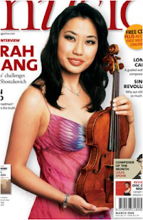 The image on the right, is for a classical magazine. She is in a pale coloured dress and is holding a violin. This is effective because it is a classical magazine, and the instrument indicates the genre instantly. Her make-up is done tidily and is not too full-on, it looks almost natural. This also shows the classical genre, because people who play classical instruments, typically, are more mature and sophisticated, so you would not expect a lot of make up on her, compared to a pop magazine. Her pose/posture is straight and turned slightly to face the camera. This shows maturity and sophistication, as you would expect to see in a classical magazine.

In this image, on the left, she is in a glitzy black dress, this is very provocative and would draw in a male audience. Her dress is very low cut, and this is what I would expect to see in a pop magazine. Her make-up is very full on, this is so much different to the classical star image, this is because it's more expected and a convention of pop culture magazines. Her pose/posture is very slouched and casual, this is effective because pop music is quite casual. Her is looking down at the camera making her look empowered and superior.

The star image on the right, he is in all black clothing, this relates to his nickname the "Prince Of Darkness", this a convention of rock magazines because rock is stereo-typically dark and death-like. His looks as if he as very pale white make-up on, this is also a convention of the rock genre, because stereo-typically the readers of this magazine wear pale makeup and black clothing. His stance is very aggressive, this is contrasts with the dog on his shoulder because it makes his stance seem softer and calmer. This shows signs that the magazine is also for an older audience, even thought the features inside are very youthful. This is because Ozzy is an 80s artists and isn't well known today with younger audiences. So, in a sense, it would attract and older audience.
 The star image here is in bright and non-revealing clothing. This shows it's for a children's pop music magazine. The model has next-to-none make-up on, this a convention of a children's pop magazine because children tend not to wear make-up and are influenced by stars. Her pose/posture is very fun and not too formal, this is very common in child's music magazines.
 The image on the right, is for a classical magazine. She is in a pale coloured dress and is holding a violin. This is effective because it is a classical magazine, and the instrument indicates the genre instantly. Her make-up is done tidily and is not too full-on, it looks almost natural. This also shows the classical genre, because people who play classical instruments, typically, are more mature and sophisticated, so you would not expect a lot of make up on her, compared to a pop magazine. Her pose/posture is straight and turned slightly to face the camera. This shows maturity and sophistication, as you would expect to see in a classical magazine.

 The star image here is in bright and non-revealing clothing. This shows it's for a children's pop music magazine. The model has next-to-none make-up on, this a convention of a children's pop magazine because children tend not to wear make-up and are influenced by stars. Her pose/posture is very fun and not too formal, this is very common in child's music magazines.
No comments:
Post a Comment