
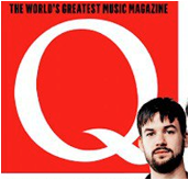
 The masthead clashes with the rest of the front cover. It's alternative to the rest of the cover. It is in a serif font to show it is quite unique. It is also only one letter to show the simplicity to the magazine and it lets the target audience gather that the magazine inside is easy to understand. The target audience gather that the magazine inside is easy to understand. The masthead is actually quite big compared to the other simple mastheads on magazines. This implies it is quite a large media corporation and a large part of the population purchase it. The quote "The World's Best Music Magazine" this enables the target audience to see that there is no other magazine comparable to it and that they should buy no other.
The whole band is on the front cover (The 1975) they are all looking down the camera and this shows direct address with the reader. This is important because it catches the readers eye when purchasing a magazine. The boys are dressed the same to show the similarities between the band. Along with similar stances and facial expressions.
The black in their clothing shows connotations of darkness, this could indicate their lyrics are a little morbid and dark.

The magazine is completely colour co-coordinated (red, black and white), except for the yellow and orange at the bottom. With these standing out it makes the headings stand out, drawing people’s attention.
The banner at the top shows the magazine is a special / collectors addition. This brings a wider audience because some people collect magazines. The special is about Oasis a very popular band from a decade ago, this will incite Oasis fans to buy it.

The font is in a Sans Serif style because it is easier to read and it is used since it is a convention of Indie Pop music and makes it stand out on the page.
There is a lot of cover stories crammed into a small space down the sides of the magazine. The text is sometimes small, which breaks codes and conventions because it is so small and crammed.
This has influenced my ideas by making me see that using block colours actually look effective when you have a lot of cover stories on the front.
This has influenced my ideas by making me see that using block colours actually look effective when you have a lot of cover stories on the front.
No comments:
Post a Comment